5ense

psa campaign/portable kit

BRAND IDENTITY

collateral

CAMPAIGN

PROBLEM

Young adults experiencing stress or panic often struggle to remember and execute the 54321 grounding techniques when they are feeling overstimulated, having a hard time remembering each step correctly despite how effective the technique is. There is also the issue of people being hesitant to address mental health issues.

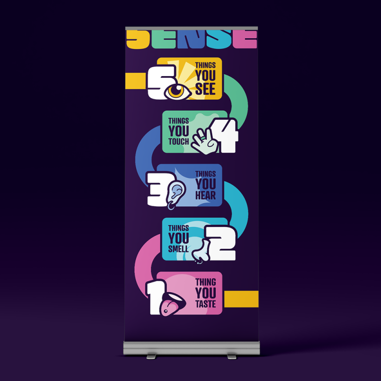
Which is why 5ENSE aims to create a system that is not only easily digestible, but also fun and engaging for people to learn the 54321 grounding technique.

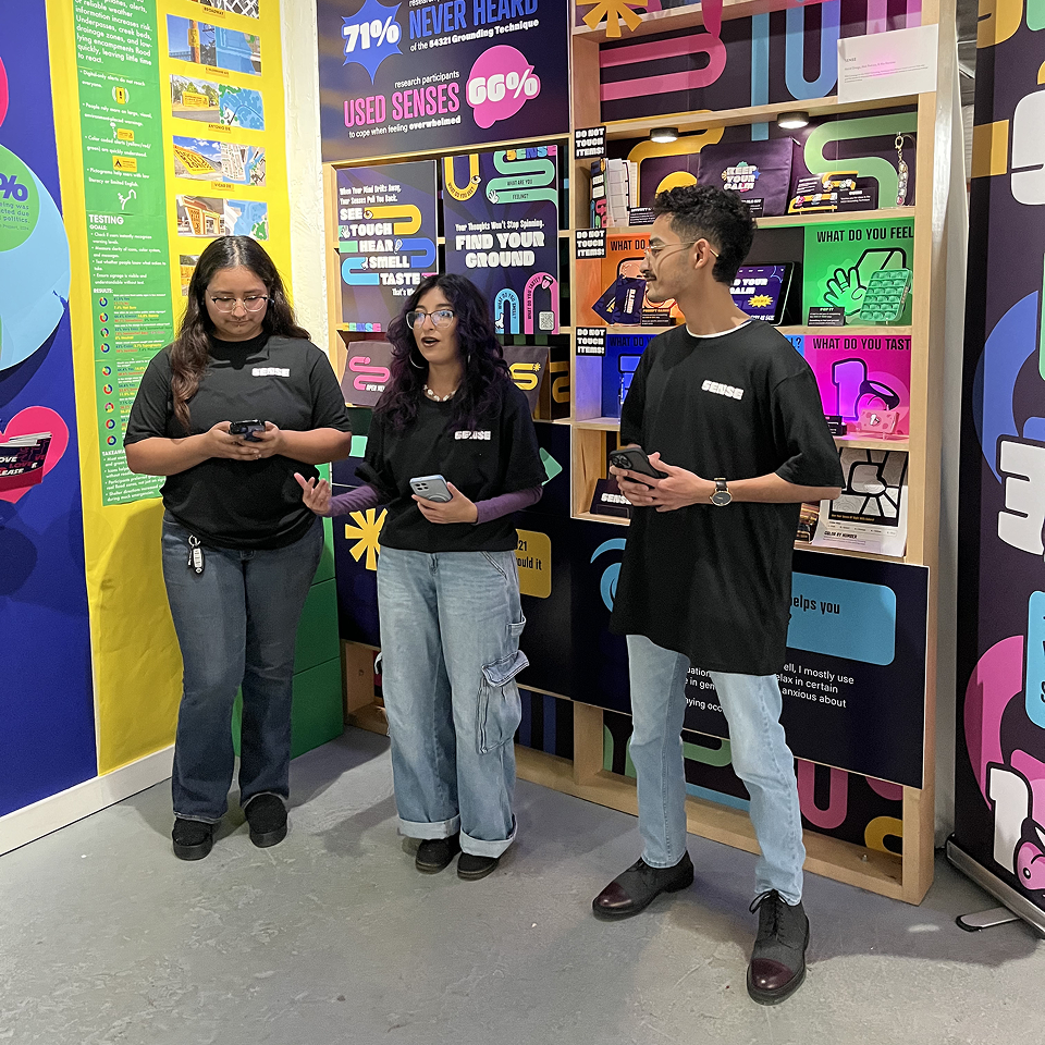
meet the team!

roles

mia martinez

Co-developed the campaign’s logo and provided cross-functional design support. Her versatility ensured a cohesive look across all creative material

astrid ortega

Conceptualized the campaign vision and brand identity. She spearheaded the development of the physical touchpoints, designing a suite of interactive grounding tools to provide the audience with tangible support.

abel pedraza

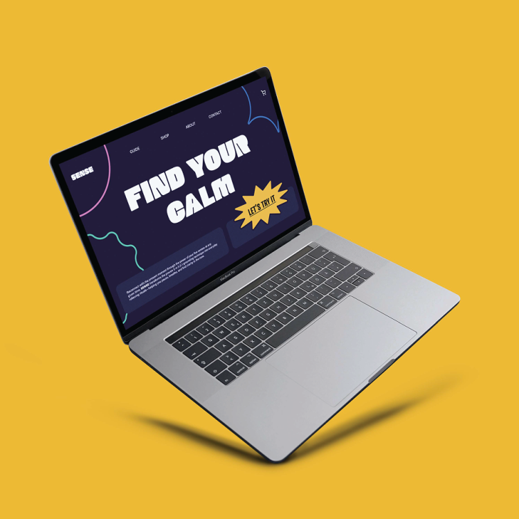
Provided the strategic oversight that unified the team’s creative efforts. He led the transition from concept to reality, managing the production of all physical materials and the development of the 5ENSE website.

approach

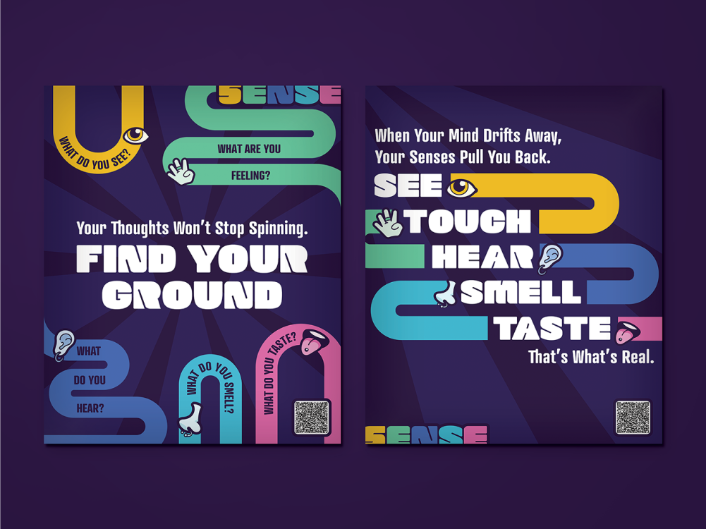
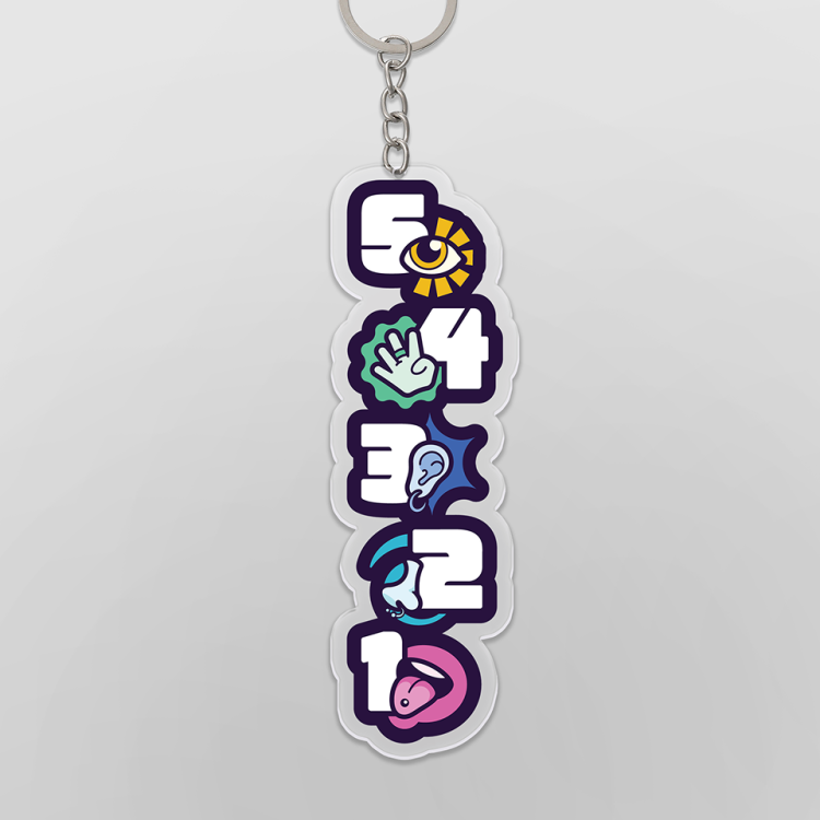
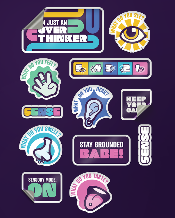
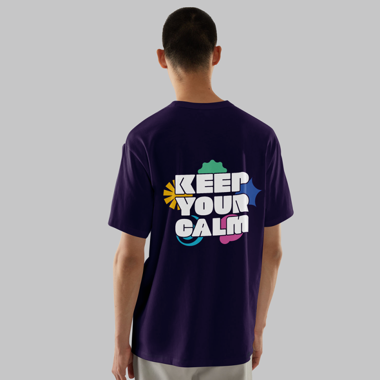
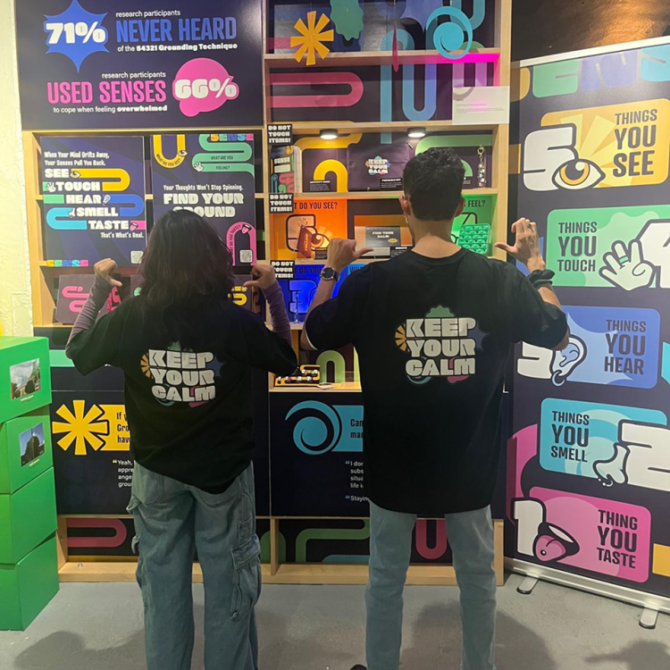
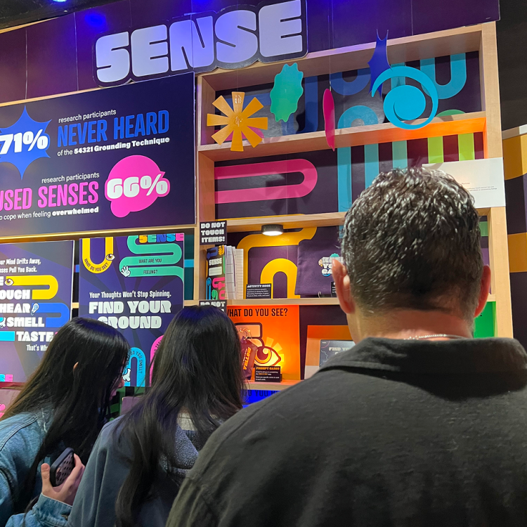
The design strategy centers on playful visual language that uses bright colors, shapes, and fun graphics to represent each of the five senses. By selecting a bold typeface and keeping the logo clean and minimalist, the branding balances personality with clarity to avoid adding further sensory clutter for an anxious user.

Solution

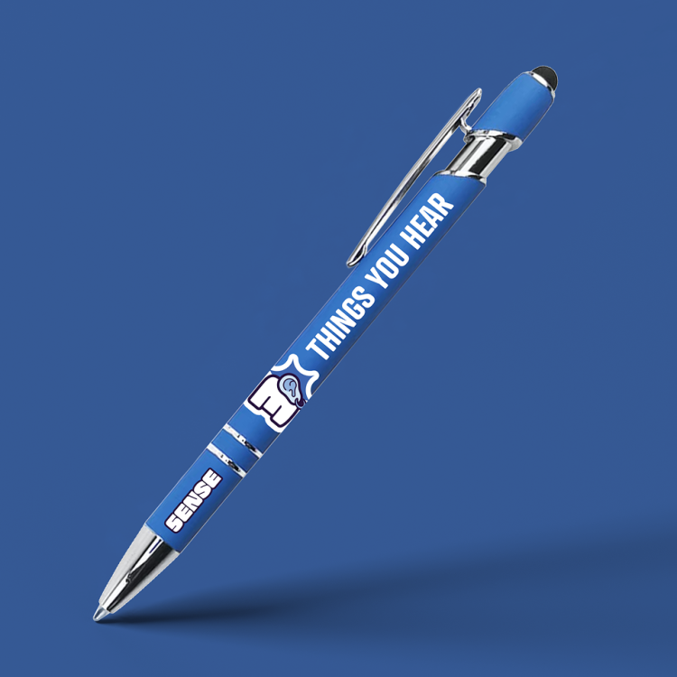
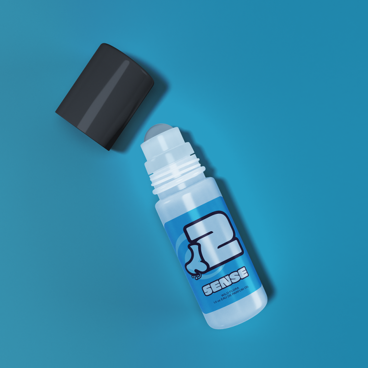
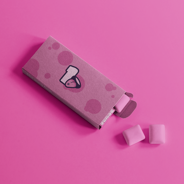
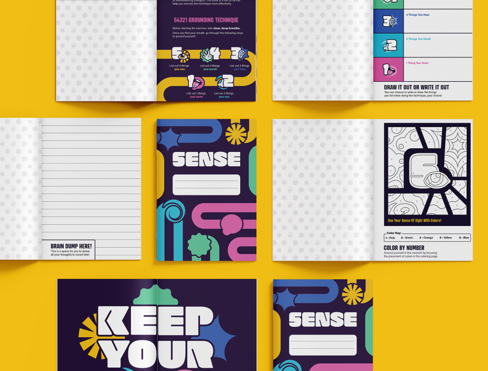
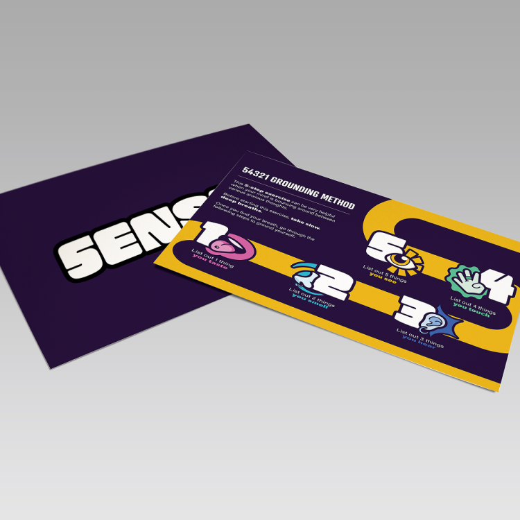
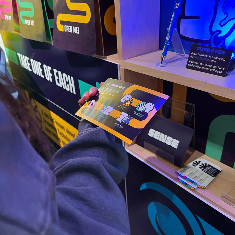
The final result is a portable kit that consists of helping tools for each step, transforming the 54321 technique into a digestible, tactile experience through visual cues and sensory objects.

This system creates an approachable safe space for users, utilizing a comforting and colorful aesthetic to make grounding feel like an engaging, intuitive habit rather than a confusing task.