Golden Grounds

park/nature

BRAND IDENTITY

collateral

website

PROBLEM

Golden Grounds needed a branding that conveys they are a park that offers a transformative outdoor experience designed to foster personal growth and a deep connection with nature. They want to accomplish that with their unique blend of activities: quarrying, yoga, and rock climbing.

approach

There was a lot of research behind this, and as I was researching about the area Golden Grounds would be located, which is at Lake Tahoe, one of their native wild animals is the mule deer. So I designed the logo to be a deer to represent the park.

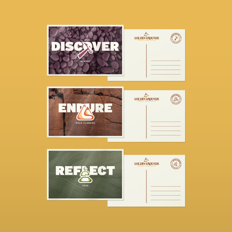
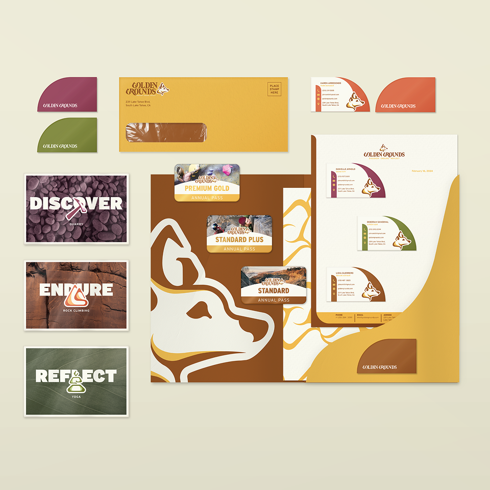
Since they are wanting to highlight their three activities of rock climbing, yoga, and quarrying, I believed it was crucial to design icons to represent each activity a long with assigning designated colors and brand language to make each of these activities more memorable to park visitors.
Solution

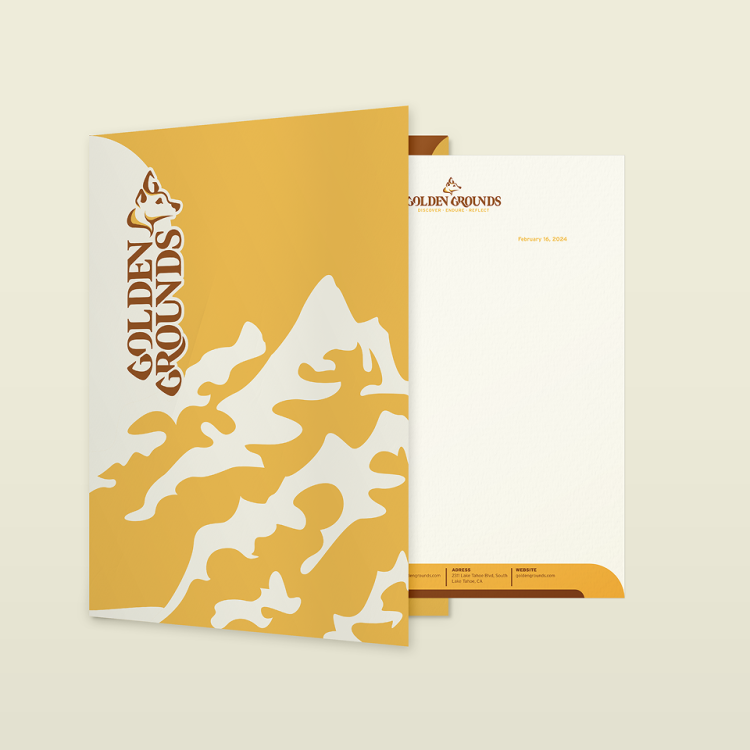
Since the park were aiming to attract people in their late twenties to forties, it was ideal to create a branding that is clean and has a premium feel to it. A key to it was designing the icons and logo in a consistent style and using the colors intentionally.

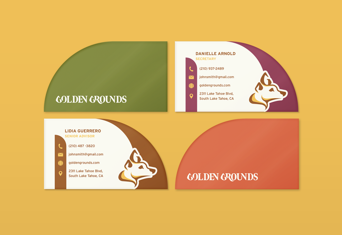
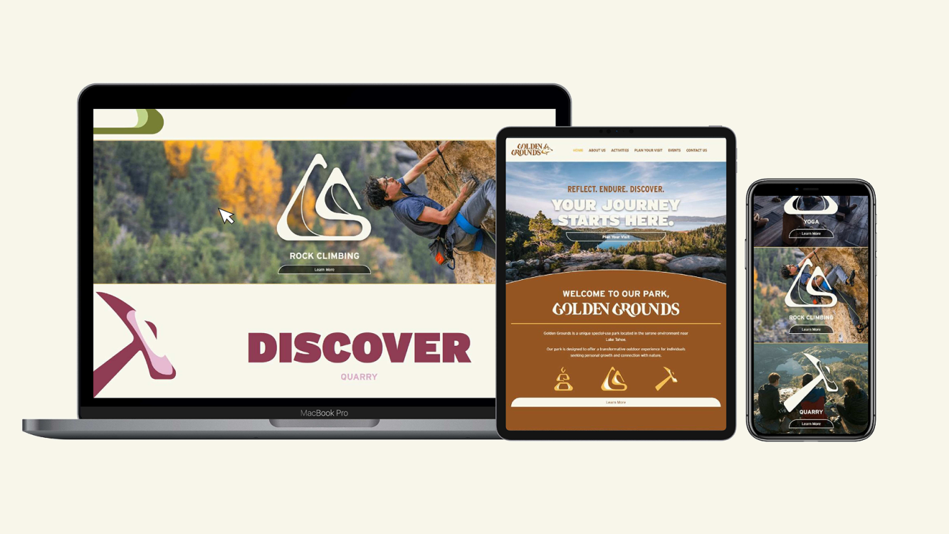
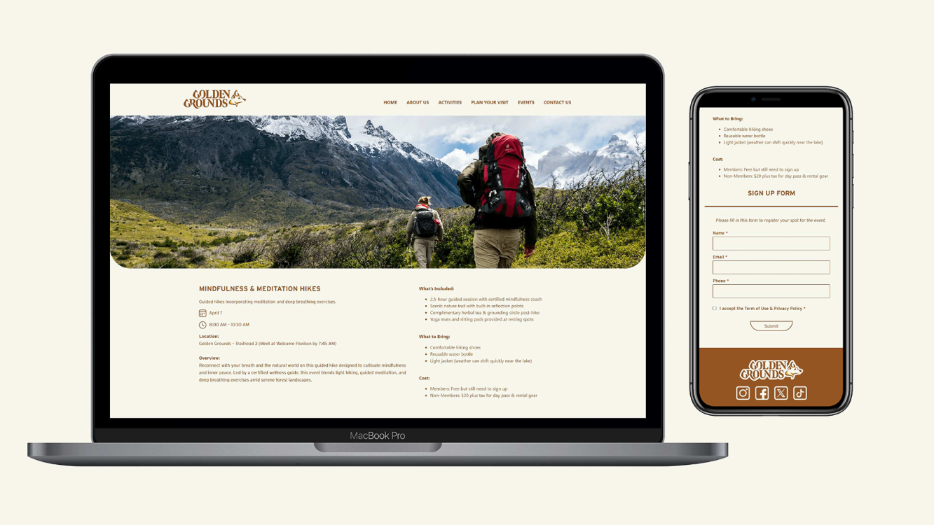
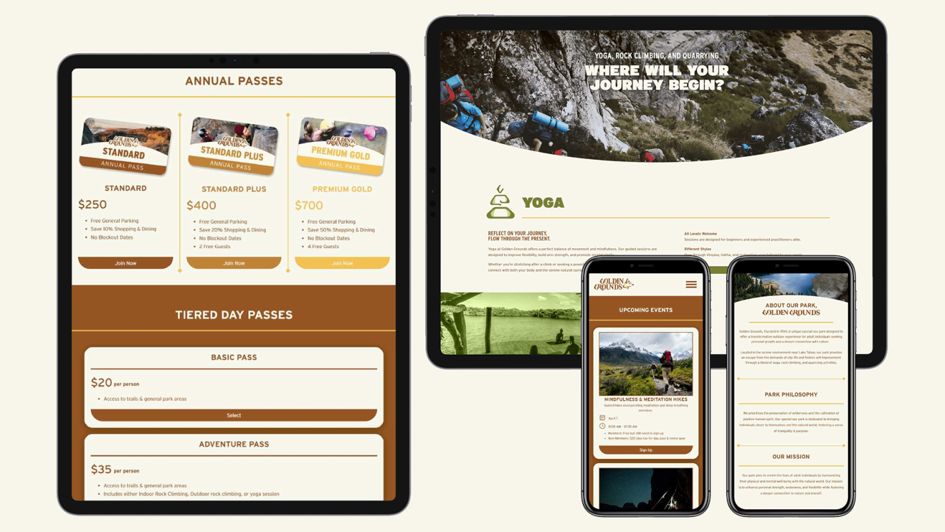
The stationary showcases how the branding would look for their offices while the annual passes gives more insight on how the park would function with their consumers. Included a website for potential visitors to get more information on the park, see what Golden Grounds offers, and book a trip. An additional collateral was also added of merch and tools that consumers would use though out their time at the park.