Sol Heat

breakfast Hot sauce

BRAND IDENTITY

packaging

PROBLEM

Many hot sauce brands use aggressive or intimidating aesthetics that can overwhelm consumers or make spice levels difficult to decipher. This creates a barrier for those seeking a flavorful breakfast option but who are unsure of the heat intensity. Without clear visual cues, shoppers may feel confused about which product suits their palate, leading to a lack of brand approachable and trust.

approach

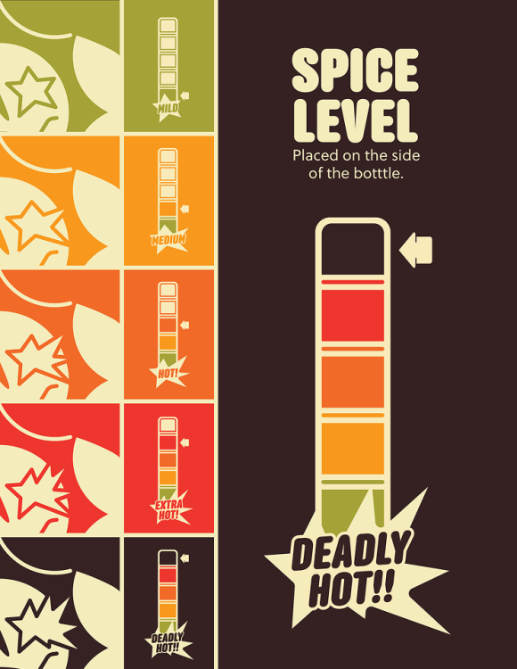
The strategy focuses on creating a "bold, modern, and fun" identity using a warm, analogous color palette and custom-built typography. By utilizing a mascot-driven illustration system—specifically a sun whose eyes transform based on heat levels—the design establishes a functional hierarchy.

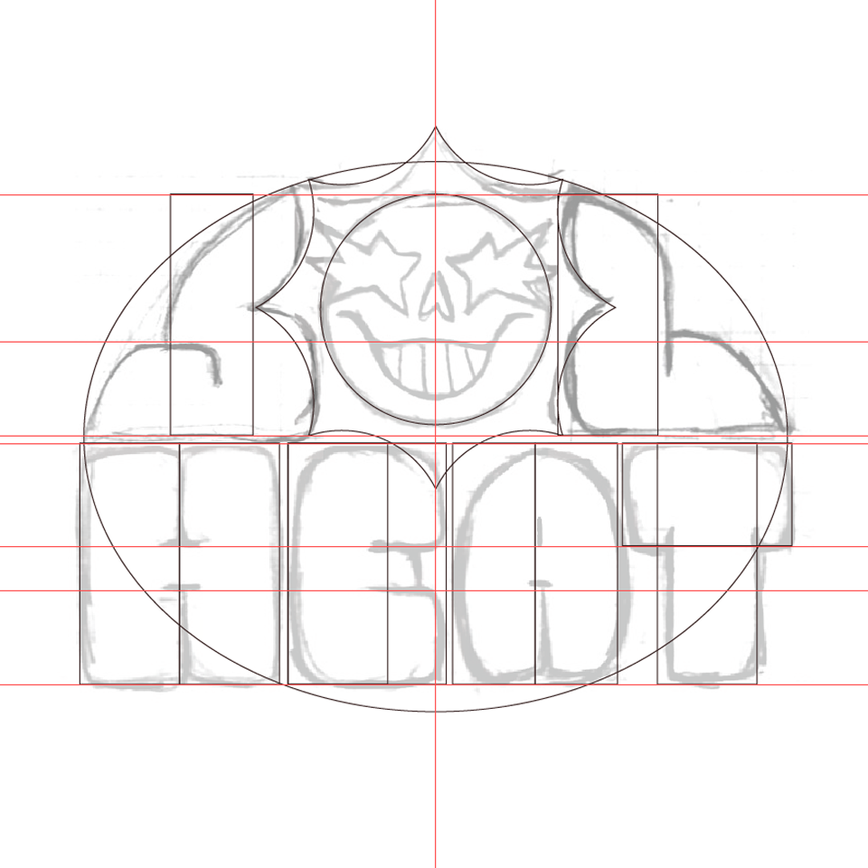
This process combines hand-sketched vector wordmarks with a methodical "spice scale" to ensure the brand feels both artisanal and highly organized.

Solution

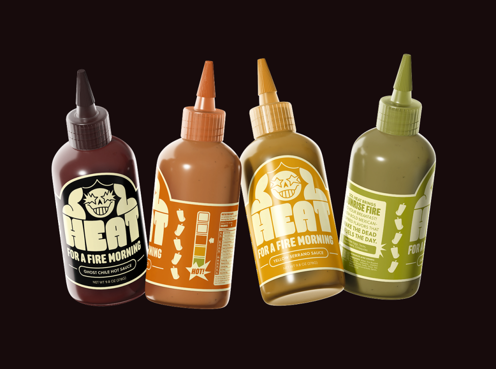
The final branding utilizes an evolving sun icon and a coordinated "eye-shape" scale to provide instant, intuitive communication of spiciness without being off-putting. High-contrast, warm tones and a mix of custom lettering and professional fonts like Anchor and Soleil create a cohesive, shelf-ready look.

This results in a distinctive visual system that balances approachable, fun energy with the clarity needed to stand out from competitors.